What is "Good" Layout?
The Good, the Bad, and the...I'm confused
One of the many things the ttrpg hobby is opinionated about is layout and graphic design. I am not expert in design, but I too have opinions! When I consider an rpg product, I am really interested in the effective communication of its ideas and rules and its usability at the table. There are many products that are just so efficient at delivering core ideas, a testament to both succinct and clear writing and thoughtful layout and design. Other (often mainstream) products look like they just copied and pasted the text and called it a day. A third, perplexing category are products that receive plaudits for their design and layout but which I find unintuitive and difficult to use. Some examples of each of these categories.
The Good
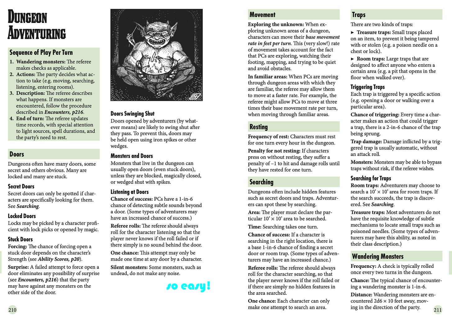
Old School Essentials is obviously the standard bearer in communicating ideas effectively across a two page spread. While some say it lacks the charm of the original, it more than makes up for it in efficient, “control panel” two page spreads. While the rules of b/x demand some awkwardness (e.g. in monster stat blocks that are cluttered if still much better than 5e), overall it’s all handled really well and is easy to read
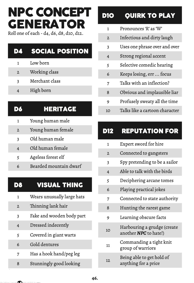
I also really like The Black Hack 2e for layout. As with OSE, the writing is concise and clear, allowing for each topic to be confined to one page or a two page spreads. I especially like the DM section, which has economically organized tables to get your (very gonzo) old school game started. (Shouts to Maze Rats here too for its single page landscape spreads).
Trilemma Adventures has mastered the one-page (or two page) dungeon format, with its evocative maps and easy to scan text. The one page format is extremely popular for its brevity and promise of a night’s worth of play, but I’ve seen many that were overly cramped for one page, as if the challenge was just about packing in the most content on a single page.
The Bad
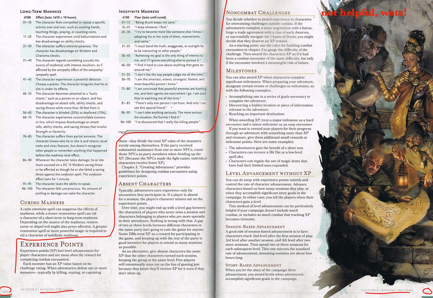
The A4 trad games seem to not prize layout and graphic design as much. Chief offender here for my is the 5e dmg, which has poor information design overall. The chapters are in the wrong order, and within each chapter important information is often juxtaposed with rules your table my never use. For example, what should be a very important section for a dungeon master—awarding experience—is confusedly mixed on the page with the second page of “madness” rules. It conveys to the new DM that awarding experience is of the same level of importance as the random table for long term “madness” (we call it madness because it’s still the 19th century, apparently). The experience rules themselves are too short to be useful and yet at the same time vague and noncommittal in what they do say. The whole book is like this.
The…Weird
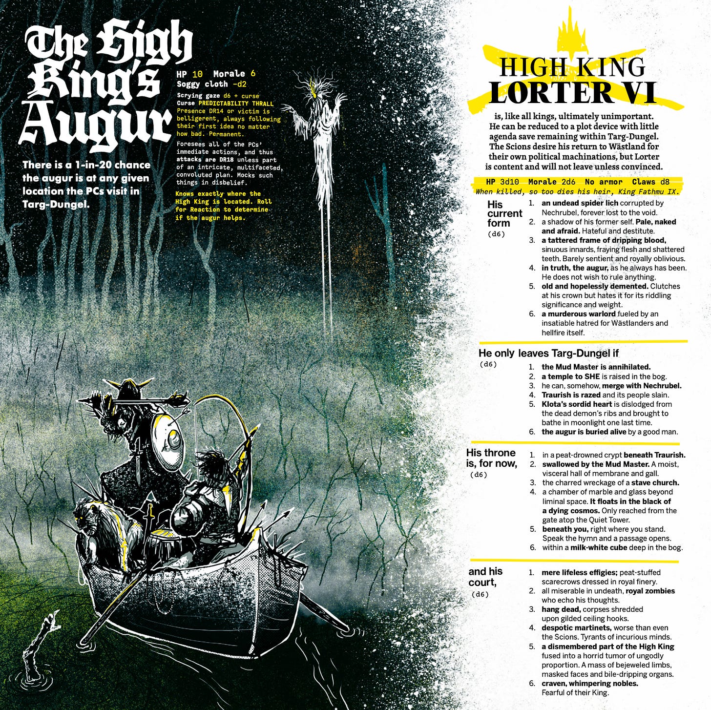
Here’s where it gets confusing for me. These are products that are well regarded, specifically for their layout, but that I find made some confusing decisions in its process. First up is Mörk Borg’s Putrescence Regent. Mörk Borg has been extensively criticized for its almost-confrontational layout, with many saying that it is style over substance. I strongly disagree; the layout and art in the core book conveys its tone non-verbally. You can show the books and zines to anyone, and they will immediately understand what the game is going for. This is a game in which you might have only a femur for a weapon; d4 damage. It’s excellent. Moreover, the parts that need to be well organized are, exceptionally so, including the dungeon crawl and the summary of core rules.
So it’s as a fan as I come at the layout of Putrescence Regent, a kickstarter that I backed (like all the other MB kickstarters). Overall I love the idea of the project, and the music is great; I can’t wait to play a MB game where I can play it to set the mood. However, when it comes to the actual rpg content, despite the high production value, I am a little disappointed. The sleeve contains a map, random encounters, and some other tables, while the insert mostly details one town, three factions, one dungeon, and the bbeg. I was instead expecting a regional point crawl, thinking that the booklet would detail a handful of dungeons, maybe six. I would say this is a missed opportunity. The 12x12 format is huge compared to the A5 norm that many OSR products adhere to, and yet it feels like they don’t do a lot more with the extra space. The minimalism of many OSR games are what allow them to be flexible but also add to their usability at the table, and I’d argue this is even the case for the Mork Borg core book (where the rules all fit on one page that is included in the endpapers).
The larger format of this product, however, both decreases its at-the-table usability while also making the paucity of content rather conspicuous. The bbeg who takes up a full 12x12 page is detailed in a couple sentences, a short statblock, and then three d6 random tables. It’s not that I necessarily need more info, but it is weird that they didn’t think to use the extra page space to provide something evocative (a familiar? Minions? Interesting items?). Now, interestingly, looking at just the digital image, it looks ok. But when the product is in my hands it does feel sparse. I think these extra large pages would have been perfect series of well-designed one-page dungeons.
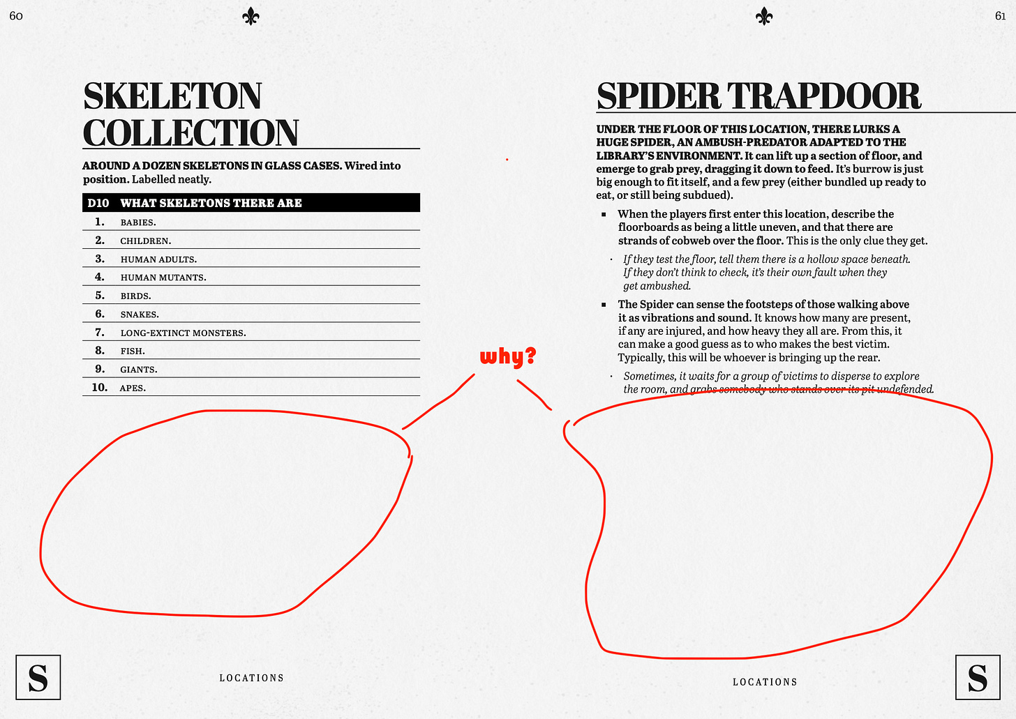
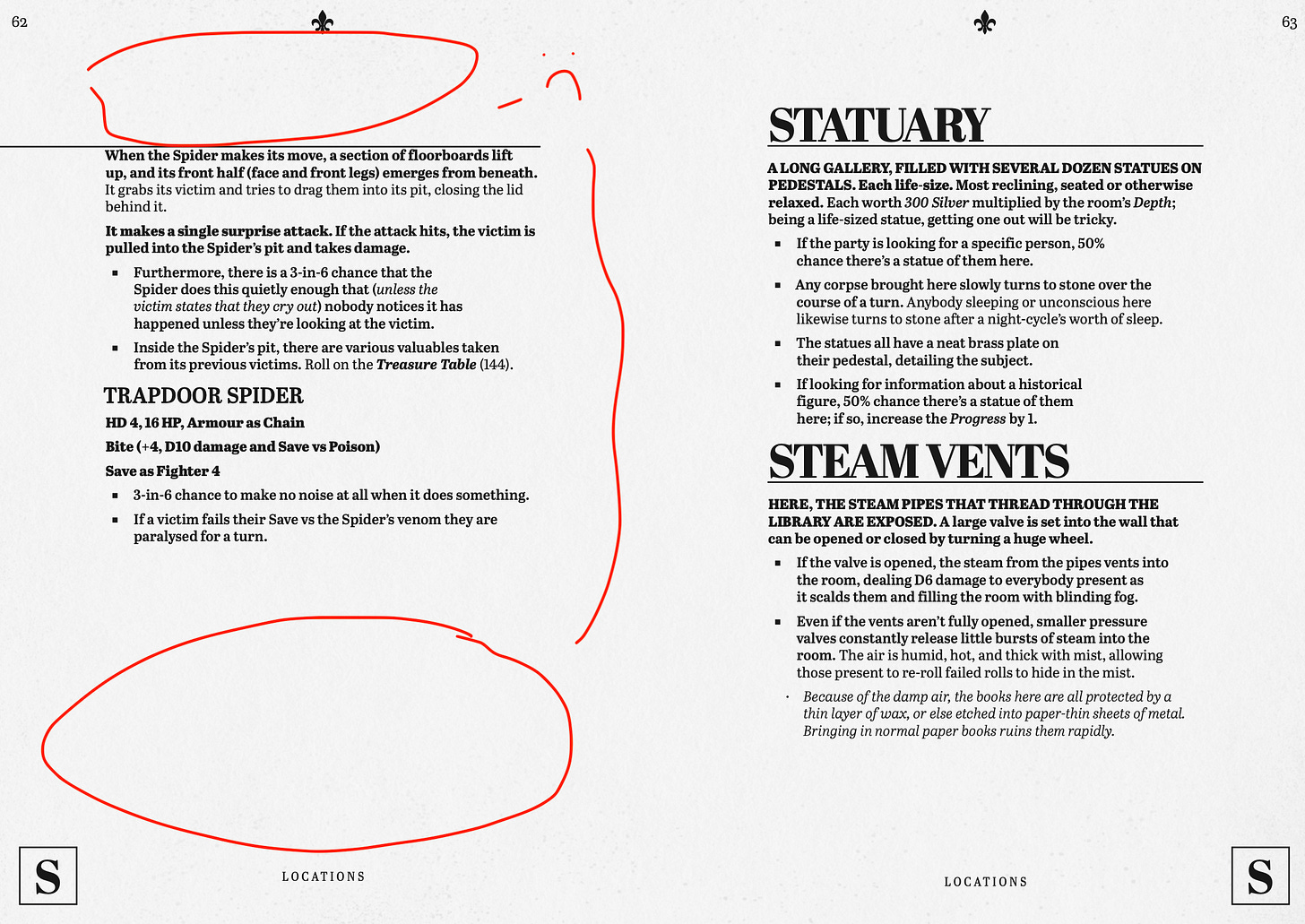
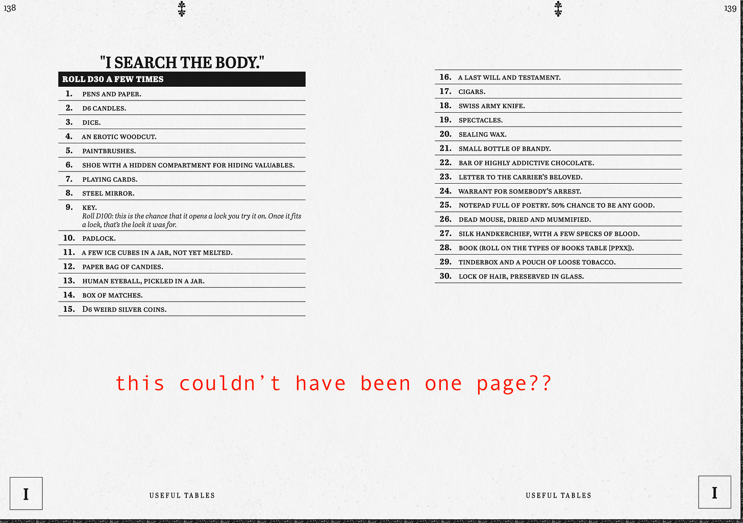
Finally, the most perplexing for me is The Stygian Library Remastered. First of all, Emmy Allen’s The Stygian Library is an innovative, wonderful product. It’s full of creativity and treats the GM as a player, there to be surprised as well. But it presents particular problems for information design, because the whole dungeon (a “depthcrawl”) is generated live during play. For this reason, probably the best “version” of the Stygian Library is an online generator made by a fan. Unfortunately the remastered version is just a very nice reproduction of the original with some (great) added art, but is not a product that is more usable than the original.
Perplexingly, they did not make use of the endpapers to include any of the necessary tables that the GM will have to consult regularly during play, even though there are several (6) pages at the end of the book that are included but only contain the generic endpaper art. Meanwhile, they organized the interior with large margins and large title fonts, with the result that they could only present so much information per page. The result is a page that contains a discrete unit of information and a lot of unnecessary white space, and is no more satisfying than an overly full a4 trad page. Tables that could have helpfully been fit on one page are spread over two, and even though it’s an a5 book, with the margins the actual content of the page feels more like a pocket-sized book.
There was some criticism along these lines on reddit that Soul Muppet took umbrage at. In terms of qualify of materials and content, it is top tier and worth the price, but if you are looking to actually run this adventure, I would rely on the pdf plus the online generator.
Also!
Cheat sheets and screens - a GM’s best friend, at least in an ideal world. In addition to OSE and The Black Hack, I would single out the sheets for Blades in the Dark
Character sheets - give everything a player needs on one page. Playbooks for story games have the right idea here. There’s also these Whitehack 3e sheets that have been clutch for my group.

